Showing posts with label Poster Production. Show all posts

Monday, 28 March 2011

Further Poster Progress

We have changed the previous white background of our poster, to a picture of a train; however we changed the opacity of this image, so the picture of our protagonist sitting on the bench is the main focus of the poster.

We also decided to omit the train track positioned in-between “Inter – section”, because we felt it did not look right and looked more like a ladder than a train track. Moreover, we enlarged the writing for the title of our film and put it in a white font with a black background behind it, so this way it is much more noticeable and easier for people to read.

We feel our poster looks much more professional now and we are happy with it. We are going to show it to people to hear their thoughts and opinions on it.

Our film poster

Friday, 25 March 2011

Poster Progress

We have been making constant developments to our film poster. We have our main image of Lucas positioned on opposite ends of the bench, which is the main focus of the poster.
We have the title of our film “Intersection” at the top of our poster and when deciding on typography, after much discussion, we chose a font which we believe reflects the style of writing used on train station information boards, hence relates to the plotline of our film. Also, we had to keep in mind serif and sans serif fonts, as from our poster research, we noticed how more recent film posters include sans serif fonts, so we wanted to make sure we abide by this rule. Underneath our film name we have placed our tagline. It originally was: “Sometimes it’s the smallest decision which can change your life forever” yet we felt this was too long, so have now shortened it to: “The smallest decision can have the biggest change” and by employing the words “small” and “big”, binary opposition has been created.

We then decided upon separating the words ‘Inter – section’ by positioning a train track in-between the 2 words, reiterating the split narratives within our storyline. However, at the moment we feel the image does not look like a train track and more like a ladder and could be confusing to people, so is something we need to develop.

Additionally, we believe that currently our poster looks quite plain, due to the fact it’s on a white background. So, we have considered adding a slightly transparent picture of the train in the background.

At the bottom of the poster we have included important information about the film, including the production company, the actor’s names and the names of those who produced, edited and directed it. We have decided to put our film in association with Miramax Pictures, as they produced “Sliding Doors”, a film which we consider to be similar to ours. We have also included the logos for Miramax and our production company “Tick Tock Productions” at the bottom of our poster.

Our film poster currently

Wednesday, 16 March 2011

Creation of our poster photo

We used Adobe Photoshop Elements 8 to create the photo which is featured on our poster.

First of all we chose our first picture of our protagonist sitting on the bench and cropped him out of that picture, placing him on our second picture of him sat on the bench, later aligning the images correctly so they matched. I then adjusted the brightness with the ‘dodge tool’, so that both images were the same colour. 


However, we did encounter a problem. As the bench was shaded by trees and it was a sunny day, when Lucas sat at different ends of the bench a shadow was created. This meant that the bench was a different colour in the separate pictures due to this shadow, although this was not noticed until we were aligning the pictures together. Therefore, I decided to use the ‘eyedropper tool’ to pick out the colour of the bench in one picture, so we could then apply that exact colour to the other parts of the bench where it had been affected by the shadow. However, by using this tool, it only picked up on a very flat colour and would not look realistic. So, I copied bits of the bench from the first picture and positioned them on the second picture to make the bench one consistent colour. 


Additionally, in some places it was obvious that we had cropped 2 pictures together, so I used the ‘smudge tool’, to make it look like more realistic and one individual picture.

We then decided that we did not want the background scenery to be seen on our poster. So we decided to use the ‘lasoo tool’, to only select the image of Lucas on the bench, thus discarding the background.

Now that we have just the image of Lucas on a bench against a white background, we can now add the name and tagline of our film, our actors and our production company all to our poster.

Here is a screen shot from when I was editing the picture in Adobe, you can see the problem we encountered of the bench being different colours due to the shadow.
The final picture

Our poster photo with a white background


Friday, 4 March 2011

Poster Changes

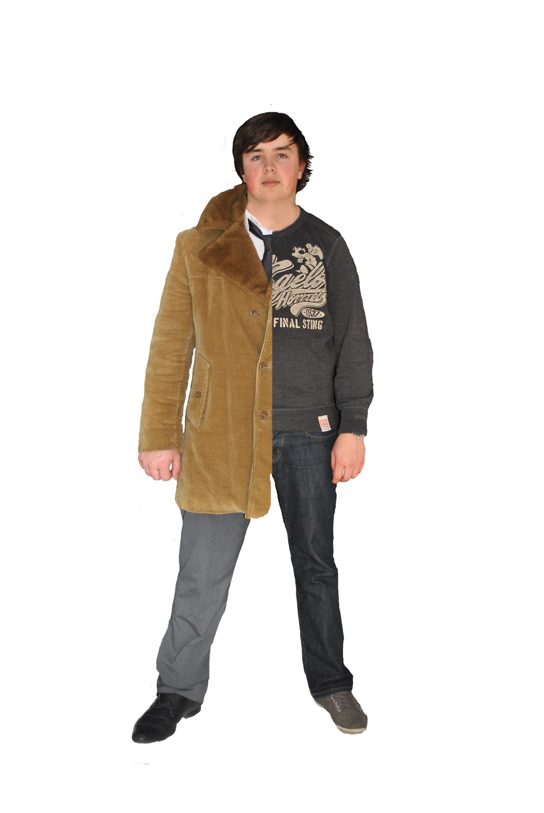
We have decided to change our poster idea once again. We recently took photographs of our protagonist wearing casual and smart clothes. This is because on our poster, he will be featured wearing a suit on the left side of his body to reflect the business narrative of our film, and on the right side he is seen wearing casual clothes, representing the family orientated life of our film. However, after editing and merging the photos together, we feel that it looks quite amateur and is not right for our film. Therefore, we have now decided upon another poster concept. This will feature our main protagonist Lucas, where he will be visible at two ends of a bench. On one side of the bench he will be sitting in a suit reflecting the successful life and at the other end he will be sitting wearing casual clothes to represent the family narrative. We feel this will have the same effect as our other poster, as it reflects the two different narratives of our film, however it will hopefully look more professional than our other poster idea.
Our first poster idea

Wednesday, 2 March 2011

Pictures for our Ancillary Task

We took photos for our film poster and are now going to use Adobe Photoshop to edit the pictures.
Casual Lucas
Successful Lucas

Saturday, 19 February 2011

Poster research

Our poster is an important part for the marketing and distribution of our film, as it will help to persuade people to come and watch it. We want our poster to not only being interesting so it attracts our demograph, but also relate to the storyline of our film. Our poster will not only include our main protagonist, but also the title and tagline of our film, our production company and our actors. The proxemics of the protagonists on the poster is something we must consider as will help to convey messages about our film.

We have already looked at the posters of “Sliding Doors” and “Memento” as they are similar to our short film. We particularly liked the layout of the “Sliding Doors” poster as it reflects the 2 parallel narratives within the film.

How to Lose a Guy in 10 Days - Poster
This poster for “How to Lose a Guy in 10 Days”, consists of the 2 main protagonists, leaning on each other back to back, with them being the focus of the poster. The concept of them leaning on each and being back to back is quite a common convention of rom-com posters and is quite a simple yet effective idea. They are both relatively famous actors, so their names are included in quite a big font, as the fact they are very well known is also helping to promote that film. However, with our film, our actors are of course not big Hollywood names, so we do not have that advantage. The positioning of the actors and the title of this film connote the genre of romance, signalling that it is intended for a female demograph. The poster has a colour scheme of red and green which goes very well with background and the title is positioned effectively in between both the actors with the tagline positioned at the bottom of the poster. We could maybe incorporate this style of poster to ours, with Lucas stood back to back with the successful version of him and the family version of him.

Ghost Town - Poster
The poster for “Ghost Town” is an interesting poster and reveals quite a bit about the film, something which we want our poster to do. From the background scenery we can tell it is set in NYC and the use of the bench is an interesting way to position the 2 protagonists of the film. The tagline and the main photo relates to the plot of the film and the very light gradient used also corresponds with this ‘ghost’ theme. We could incorporate a bench within our poster, as it is quite a simple yet effective idea.
Mission: Impossible - Poster
This poster for “Mission: Impossible” is an effective idea and uses the distinctive face of their very famous actor to their advantage. Nevertheless, we are not able to create our poster in a similar style to this one, due to the fact the actors of our film are not well known, unlike Tom Cruise.
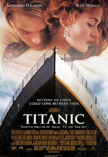
Titanic - Poster
The poster for “Titanic” includes a close up embrace between the two famous actors within that film, relating to the romance issues of this film, yet their facial expressions convey a sense of sadness, relating to the tragedy within the plotline as well. The other prominent image of the poster is the ship, which of course is what the film is about and named after. As in our short film the train station is the place where Lucas experiences his visions, a train on the front of our poster would be relevant and is a possibility.
The Happening - Poster
The poster for the film “The Happening”, is very clever and interesting, although it is a different genre to our film. This poster connotes the genre of horror/thriller and gives the impression that it’s going to be quite a fast paced action style film, with some element of tragedy implied. The protagonist’s name is featured on the poster as well as the tagline and the film name in quite a simple font style. Additionally, the choice of the cold blue/ dark tone reflects the genre of the film and mood of the plotline.

Wednesday, 16 February 2011

Changes to our film poster idea

Originally we had decided that our poster would contain the image of our main protagonist standing on the crossroads of a train track, to signify how the message of our film is about making decisions. However, it has been very hard to find a location where we can capture this photo, as obviously we cannot have our actor stand on an actual train crossing. Therefore, we have come up with another poster concept. Our main protagonist will still be feature on the poster, yet on the left half of his body he will be wearing a suit to reflect the business life within our film, and on the right side of his body he will be dressed in casual clothes, representing the family orientated life of our film.
We feel that this poster idea will still represent our film, as it will reflect the two different lives incorporated within it and how he must choose one. Furthermore, hopefully it will interest our demograph into watching our film. Nevertheless, we understand that our poster could be difficult to create, as we will need to take the 2 photos of our actor in exactly the same position when wearing the different clothes, otherwise when we edit it on Adobe Photoshop it will not correspond correctly.

Tuesday, 1 February 2011

Planning for producing our poster

We have already planned a draft of our poster ancillary task, whereby our main protagonist Lucas is positioned in the centre with 2 railway tracks behind him, reflecting how he has 2 life changing decisions to make in our film. We had the idea of Lucas standing on a train track with 2 different paths splitting off, however, we understand for safety reasons we of course cannot allow him to stand on a train track. Nevertheless, Moors Valley Country Park has a children’s mini railway station, and it would be suitable there for Lucas to stand on the track without getting injured. The picture above shows the two tracks splitting off and we hope we will be able to position Lucas there, in order to capture the photo for our poster.

The railway track at Moors Valley Country Park

Wednesday, 3 November 2010

Draft of Poster Ancillary Task

Within our group we have been discussing ideas for the poster of our short film. As it revolves around one character, Lucas and how one decision can change his life, we all agreed how an image of him must be on the poster. We have the idea of showing Lucas standing on the platform at the train station, as this is where he experiences the flash forwards of the different lives he could leave and where he has to make the decision upon which life to choose. Moreover, we want there to be 2 train tracks behind him leading to different directions, hence reflecting the plot of our film. We also like the concept of having Lucas as a silhouette image.

We have created a draft for our poster by using Adobe Photoshop. We found an image of a man, which we cropped to show him on his own and positioned 2 train tracks either side of him. We then placed a picture of a train as the background to the poster, making it more interesting and not so empty. This is just an idea of what we want our poster to look like, as when we create the actual one for our film, we are going to use an image of the actor who is playing our main protagonist.

Our poster includes the title of our film, the name of our production company and the tag line which is: “Sometimes it’s the smallest decision that can change your life forever”, reflecting how whatever choice Lucas makes at the train platform – to help Grace up or get on the train – will change his life drastically.


Draft of our films poster