I have previously researched The Guardian and Empire film reviews, making note of the structures, layouts and audiences, so I make sure I create the right style of review for our short film.
We feel Empire would be the right magazine for our review as it is read by the same demograph as those who would watch our film (18-35) and due to being a worldwide company, it can help with the promotion of our film.
As we can see with the ‘Inception’ review from Empire Online, they arrange it with a Plot, Review and Verdict structure, which we feel is a good way to layout our review. We believe it is easy for readers to follow as this way they can choose to read only certain sections if they wish to do so.
Empire Online - Plot, Review and Verdict structure
Regarding the magazine versions of Empire, they still employ the same structure as the online versions. The review below incorporate still images from the film which is something we intend to do, as it will give the reader an insight into our short film and the locations and actors involved.
Empire Magazine Review - Use of still image from film
Some film reviews, for example the one below, has a still image from the film, set as the background of the review page with the text overlapping, which I feel is a nice feature. This review also includes other images as well, proving to be an interesting layout.
Empire Magazine Review - image set as background
Although we are adopting an Empire style film review, I did look at The Guardian film reviews, as they too are read by a wide audience, albeit it only British. The feature which The Guardian employed which we liked was the fact file box, as shown in the review of ‘The King’s Speech’ below.
Our poster is an important part for the marketing and distribution of our film, as it will help to persuade people to come and watch it. We want our poster to not only being interesting so it attracts our demograph, but also relate to the storyline of our film. Our poster will not only include our main protagonist, but also the title and tagline of our film, our production company and our actors. The proxemics of the protagonists on the poster is something we must consider as will help to convey messages about our film.
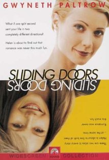
We have already looked at the posters of “Sliding Doors” and “Memento” as they are similar to our short film. We particularly liked the layout of the “Sliding Doors” poster as it reflects the 2 parallel narratives within the film.
How to Lose a Guy in 10 Days - Poster
This poster for “How to Lose a Guy in 10 Days”, consists of the 2 main protagonists, leaning on each other back to back, with them being the focus of the poster. The concept of them leaning on each and being back to back is quite a common convention of rom-com posters and is quite a simple yet effective idea. They are both relatively famous actors, so their names are included in quite a big font, as the fact they are very well known is also helping to promote that film. However, with our film, our actors are of course not big Hollywood names, so we do not have that advantage. The positioning of the actors and the title of this film connote the genre of romance, signalling that it is intended for a female demograph. The poster has a colour scheme of red and green which goes very well with background and the title is positioned effectively in between both the actors with the tagline positioned at the bottom of the poster. We could maybe incorporate this style of poster to ours, with Lucas stood back to back with the successful version of him and the family version of him.
Ghost Town - Poster
The poster for “Ghost Town” is an interesting poster and reveals quite a bit about the film, something which we want our poster to do. From the background scenery we can tell it is set in NYC and the use of the bench is an interesting way to position the 2 protagonists of the film. The tagline and the main photo relates to the plot of the film and the very light gradient used also corresponds with this ‘ghost’ theme. We could incorporate a bench within our poster, as it is quite a simple yet effective idea.
Mission: Impossible - Poster
This poster for “Mission: Impossible” is an effective idea and uses the distinctive face of their very famous actor to their advantage. Nevertheless, we are not able to create our poster in a similar style to this one, due to the fact the actors of our film are not well known, unlike Tom Cruise.
Titanic - Poster
The poster for “Titanic” includes a close up embrace between the two famous actors within that film, relating to the romance issues of this film, yet their facial expressions convey a sense of sadness, relating to the tragedy within the plotline as well. The other prominent image of the poster is the ship, which of course is what the film is about and named after. As in our short film the train station is the place where Lucas experiences his visions, a train on the front of our poster would be relevant and is a possibility.
The Happening - Poster
The poster for the film “The Happening”, is very clever and interesting, although it is a different genre to our film. This poster connotes the genre of horror/thriller and gives the impression that it’s going to be quite a fast paced action style film, with some element of tragedy implied. The protagonist’s name is featured on the poster as well as the tagline and the film name in quite a simple font style. Additionally, the choice of the cold blue/ dark tone reflects the genre of the film and mood of the plotline.
As I am creating one of our ancillary tasks; the film review, I have researched film reviews from other publications, in order to help me adopt the correct style of writing for the review of our short film.
I chose to look in detail at two different publications: Empire Magazine and The Guardian’s film reviews, to give me ideas on the best way to approach our film review. When reading reviews by these publications, I noticed how they both apply a different format and style of writing to their reviews and there were certain features of both which I want to incorporate within our film review.
Empire is the world’s leading movie magazine and it sets out its reviews in three sections: Plot, Review and Verdict, something which I felt was an interesting arrangement and easy for the audience to follow and read. The Guardian, on the other hand, does not have a set structure and its layout is much more like a newspaper article, although it does incorporate a fact file box, stating interesting facts about the film it is reviewing. It should be taken into consideration how Empire and The Guardian are created for two very different audiences, hence why there are differences within their writing styles and layouts. The Guardian is more likely to appeal to the middle class and only to a British audience, as is a British newspaper, whereas Empire is a much more global magazine, for a younger audience than The Guardian’s.
As our film has the target audience of 18-35 year olds, we need to keep that in mind when creating our film review. We believe that Empire Magazine would be a good place for our film review to be published, as it would help to promote our film worldwide and we suppose our demograph are more likely to read that type of magazine. Additionally, as we consider that our film will appeal to women more than men due to the fact it is a drama and relates to emotions and making choices, traits more associated with females; then a women’s magazine would also be a good place for us to publish our review as this would directly reach our intended demograph.
Hopefully we will create a film review that will interest and persuade our demograph into choosing to watch our short film.
We created a survey and from the results we have decided that our demograph for our short film will be 18-35 year olds, thus our actors will be of that age too, so our audience will be able to relate to them. We have also discovered that the female gender enjoy watching drama genre films, hence why we have made the lead protagonist male.
When discussing our film, we have come up with some ideas of camera shots and editing techniques which we believe would be effective in our film and interest the audience and keep them engaged.
Firstly, we had the idea of having a shot where we have our protagonist Lucas at the train station and we can see him clearly, yet the other extras at the station are walking past quickly and appear blurred, but Lucas still remains visible, connoting how he is the focus and a main character of the film. You see this feature in many music videos and our inspiration for this was The Script’s; The Man Who Can’t Be Moved music video, from 3:05 to 3:47 where you can see the cars and people moving by really quickly.
We also have the idea of including point of view shots from Lucas’ perspective, to help the audience engage and relate with him, thus view things from his opinion. We are especially going to employ this shot within our edit when Lucas is deciding whether to get on the train, or whether to help Grace, hence panning between the two of them. This indicates how he has to make a choice so is considering both options, thus leading into the flash forwards of his two different paths of life.
Our other shots will be detailed on our shooting script later on in our planning process.
Editing
Regarding editing techniques, we have decided we are going to include parallel action so will switch between showing the successful life with the family orientated life, hence contrasting them.
Furthermore, at the end of the flash forwards portraying the two different lives that Lucas could live, in both of them he will receive a letter: which in the successful life states how he has received a bonus and in the family orientated life confirms his wife is pregnant. When he opens the letter, we want to display it by the use of split screen, thus in both lives he is opening a letter, yet whereas in the family life he has his wife to celebrate with, in the successful life he is all alone in his posh mansion, hence helping us to contrast the view of the different lives to our demograph.
“Conversations with other Women” is a 2005 film directed by Hans Canosa and has extensively used the split screen technique. It juxtaposes shots and shot-reverse shots of the 2 actors in the same take for the entire movie, hence enlisting the audience as perceptual editors so they can choose which character to focus on. The split-screen is also used to display other emotional effects for example, portrays flashbacks of the past, juxtaposed with the present.
As we are going to be showing the two different lives that Lucas can live, we were thinking we could change the lighting of one of the paths, so it is easier for the audience to follow. For example, in “Memento”, one storyline is in black and white, yet one is in colour. Another film which uses different lighting for each story within the film is the 2000 American crime drama “Traffic”. There are three stories within the film and they are portrayed by all having a different distinctive look; one connotes a cold monochrome blue feel, another connotes a much warmer blossomy feel, and the last one connotes a strobe-like sharp feel. Therefore, as each story has a different look, it is much easier for the audience to identify which one they are watching, so as not to get confused.
We also have the idea of using slow motion in our short film when Grace falls over at the train station, signifying how her falling is an important part of the film, as it is then that Lucas has to make a decision about whether to help her up or ignore her. The 1999 action film “The Matrix” uses slow motion for example, in the clip above from 0:42 – 0:52 slow motion is employed and we would like to create a similar effect to this when Grace falls over in our short film.
As in “Sliding Doors”, we want to include a rewind feature, whereby the flash forwards are all then rewound backwards really fast to reflect how it is all rushing through Lucas’ mind really quickly and how he has so much information to process before making his life changing decision. Coldplay’s music video for “The Scientist”, includes a rewind feature, whereby he is seen walking backwards throughout the video, however this is at quite a slow pace, whereas in our film, we want our rewind to be at a fast pace.
Inception is a 2010 American science fiction film, directed by Christopher Nolan, the same director as “Memento”.
Leonardo DiCaprio plays Dom Cobb, a thief who extracts information from the subconscious mind of his victims while they dream. Unable to visit his children, Cobb is offered a chance to regain his old life in exchange for one last job: performing inception, the planting of an idea into the mind of his client's competitor.
The end of “Inception” is left for the audience to decide for themselves the outcome: whether Cobb was still in a dream or did he in fact return to his children in the “real world”. So, the ending of the film creates discussion among the audience and this is a feature we want our ending to produce. This is because, we are going to end our film showing Lucas at the train station after having experienced these flash forwards which shows him the options his two lives could lead him. Therefore, it is up to the audience to decide which path of life he chooses, hence engaging our demograph.
"Memento" is a 2000 American psychological thriller film which portrays two separate stories of Leonard, an ex-insurance investigator who has anterograde amnesia so can no longer build new memories, as he attempts to find the murderer of his wife which is the last thing he remembers. The events of the film unfold in two separate alternating narratives, one in black and white which moves forward chronologically in time, whilst the other in colour tells the story in reverse order, revealing more each time. As each sequence begins, the audience is unaware of the preceding events, just like Leonard, thereby giving the viewer a sense of his confusion and being able to relate to him. The film starts with Leonard killing Teddy for the rape and murder of his wife, then as the film ends when the two narratives converge, we understand the events that lead up to Leonard killing Teddy.
“Memento”, is one of those films whereby the ending is shown at the beginning, so in the opening clip of the film we can Leonard shooting Teddy, which is shown in colour as it is the end of the film and going in reverse chronological order. The clip moves backwards as we see the image on the Polaroid photo vanish, it’s then put back into the camera and the bullet is reloaded into the gun before Leonard pulls the trigger. At 1:44 the edit cuts to black and white to show Leonard in a hotel room, to represent the forward chronological order of the story. The use of the non-diegetic music helps to create apprehension and suspense, hence engaging the audience and at 1:42 the music builds to a climax and increases in volume as Leonard is waiting to pull the trigger of the gun. We have discussed when we come to edit our film, we may decide to use different lighting to portray the two different lives that our main character could lead, hence making it more obvious and less confusing for our demograph.
"Memento” also includes a voiceover in some parts, which is something we are looking into when we create our short film. This is because, as it revolves around one character there is no need for dialogue, so we thought that a voiceover may be needed to assist the audience. However, we also think that just the footage and a suitable piece of non-diegetic music may be more effective.
Although our film is of a different genre, “Memento” can be classed similar to our short film, as they both have two alternative narratives, however in “Memento” they are going in opposite orders but telling the same story, whereas in our film, they are running parallel, yet portraying two different lives.
If we look at the poster for “Memento”, it has been cleverly constructed to portray Polaroid photos within other Polaroid photos, relating to a memory inside a memory. The Polaroid photos are one of the key features of the film, as Leonard has short term memory loss, so has to take pictures of everything to help him in his investigation to find out who killed his wife. Moreover, the use of font at the bottom of the Polaroid picture, stating the title of the film has been written in quite a handwriting style font, thus relating to the film, in which once he takes pictures he writes a description, which he normally has tattooed to himself so he doesn’t forget. Therefore, this poster reflects the film vastly and includes the tagline “Some memories are best forgotten”, which is ironic to the film, as the last memory he can remember is of his wife being killed, yet he forgets everything else.
The Family Man is a 2000comedy-drama film which centers on a single wealthy man, living in his penthouse in New York City. However all that changes when he wakes up one morning in New Jersey with a wife and two kids he never had. He discovers that he is living in an alternative universe, where not even his closest friends recognize him and he is being shown what his life could have been like, had he made a different decision thirteen years ago.
This film could be compared similarly to ours, as they are both about making life changing decisions and they both contrast family life with achieving success and wealth at work.
Sliding doors is a 1998 film of a drama and romantic comedy genre. The film revolves around the main character Helen, played by Gwyneth Paltrow and the plot splits into two parallel universes, based on the two paths Helen’s life could take depending on whether she catches a London Underground train or not.
Although the storyline of Sliding Doors does sound very similar to our plot line for our short film, they both include a train and two different lives that our main character could live. However, none of the members of our group have actually seen the film sliding doors, so this is something we are looking into for inspiration on how to make our short film a success.
In the above clip, we see the main character Helen, dashing to catch her train on time, where two possible outcomes are portrayed – the first where she misses the train, and the second where she catches it. These storylines are both running parallel at the same time as we see the train leaving with her in it, connoting how she caught the train; however we also see her standing on the platform, implying how she missed the train. So now she goes on to live two separate lives following the events which occurred at the train station with her missing and catching the train.
At 0:50 we see time rewind as she is seen walking backwards away from the train and back up the stairs and the other people on the platform are also seen going back in time. Then at 0:57, time restarts again correctly and she is seen making her way down the stairs towards the train. Near the end of our short film, we want to include something similar to this whereby, everything that our main character has experienced during his flash forwards of the two lives he could lead, rewind back quickly to present day to show him stood on the train platform, conveying how it has just all rushed through his head.
The non-diegetic music during this scene helps to convey mystery and fantasy, especially when time is rewinding, as obviously this is something which cannot be done. At the start of the time rewinding, a chime sound can be heard which is then repeated again when the time restarts correctly, thus signifying how time change has happened and how a different outcome will now arise, so help keeps the audience interested and aware of what is happening. At the beginning of this clip, the non-diegetic music accompanying the video footage is quite peaceful, however at 0:18, as we see the train approaching and it cuts back to show Helen moving through people on the escalator in quite a rush, the tone of the music changes to replicate quickness and a sense of mystery, keeping the audience engaged to see what will occur. The sound of the chime is also used at 0:38 and a 1:08 when the little girl is playing with her doll as she walks up the stairs. In my opinion, the use of the same particular sound in both accounts reflects how the action occurring on screen at that time is very important. This is because, it is the actions of the little girl which makes Helen miss her train, as the first time the little girl delays her by being in the way, yet the second time her dad moves her out of the way and Helen is able to catch her train.
The non-diegetic music also has a momentum to it, which links in with her being in a rush to catch the train on time. In our film, we are planning to not include dialogue, as we think it will not be relevant and will be more appealing for our demograph if we just have our footage with appropriate non-diegetic music. Therefore, the type of music we choose needs to be important, as in this clip from Sliding Doors the non-diegetic music conveys fantasy, so reflects the genre of this film. It also creates suspense, hence keeping the audience interested and can reflect the mood of the characters due to the actions which are happening on screen. Diegetic music is also incorporated, for example the sound of the train and footsteps, all helping to create verisimilitude.
At 1:12 the pace of the edit changes into slow motion, as she just manages to stop the train doors from closing whilst she gets on the train, before returning to normal pace again at 1:17. During the slow motion the non-diegetic music decreases in volume and when it returns to normal pace it has a slightly happier feel to it, connoting how she caught the train on time and is pleased about that. Then, when the camera pans to show her outside the train, the music changes to imply a sadder tone, reflecting how she missed the train. In our film, when our main character sees a women fall over on the train platform, we would like to have that shown in slow motion, as we feel it is a very significant part of the film, as it portrays how he has a decision to make regarding the women; whether he helps her or ignores her to catch his train, determines the life which he will lead. Additionally, we shall have to choose a very distinctive sound when she falls over, also connoting how this is an important part to our film. Therefore, the use of slow motion and the non-diegetic music helps to convey important aspects of the film to the audience.
Also, I think the shot at 0:22 is an interesting shot and different from the others of Helen being in a rush. The footage has been edited to switch between the train approaching and Helen in a rush to catch her train on time. At 0:28 the pace of the editing speeds up, as it switches much quickly between the train and Helen, indicating how something is going to happen soon and that the train and Helen will finally meet.
Regarding mise-en-scene, this is accurate as the setting creates verisimilitude and the use of extras at the train station and those departing the train also help to make things believable for the audience.
Therefore, there are many features that are employed within this short clip from Sliding Doors which we are hoping to include in our short film, for example: slow motion and time rewinding.
Another feature we must consider is the poster of “Sliding doors”, as creating a poster is one of our ancillary tasks. The poster of “Sliding doors” is quite effective, as it shows the 2 different paths of life that the main character “Helen” could lead, one at the top of the poster, and the other upside down at the bottom of the poster, like a mirror image reflecting how in the film the two lives are running simultaneously, yet involve leading her in completely different directions within life. Therefore, this is something that we can use as inspiration when we come to construct our poster, as our short film comprises of two different lives also.