Thursday 31 March 2011

Additional Dialogue Scene

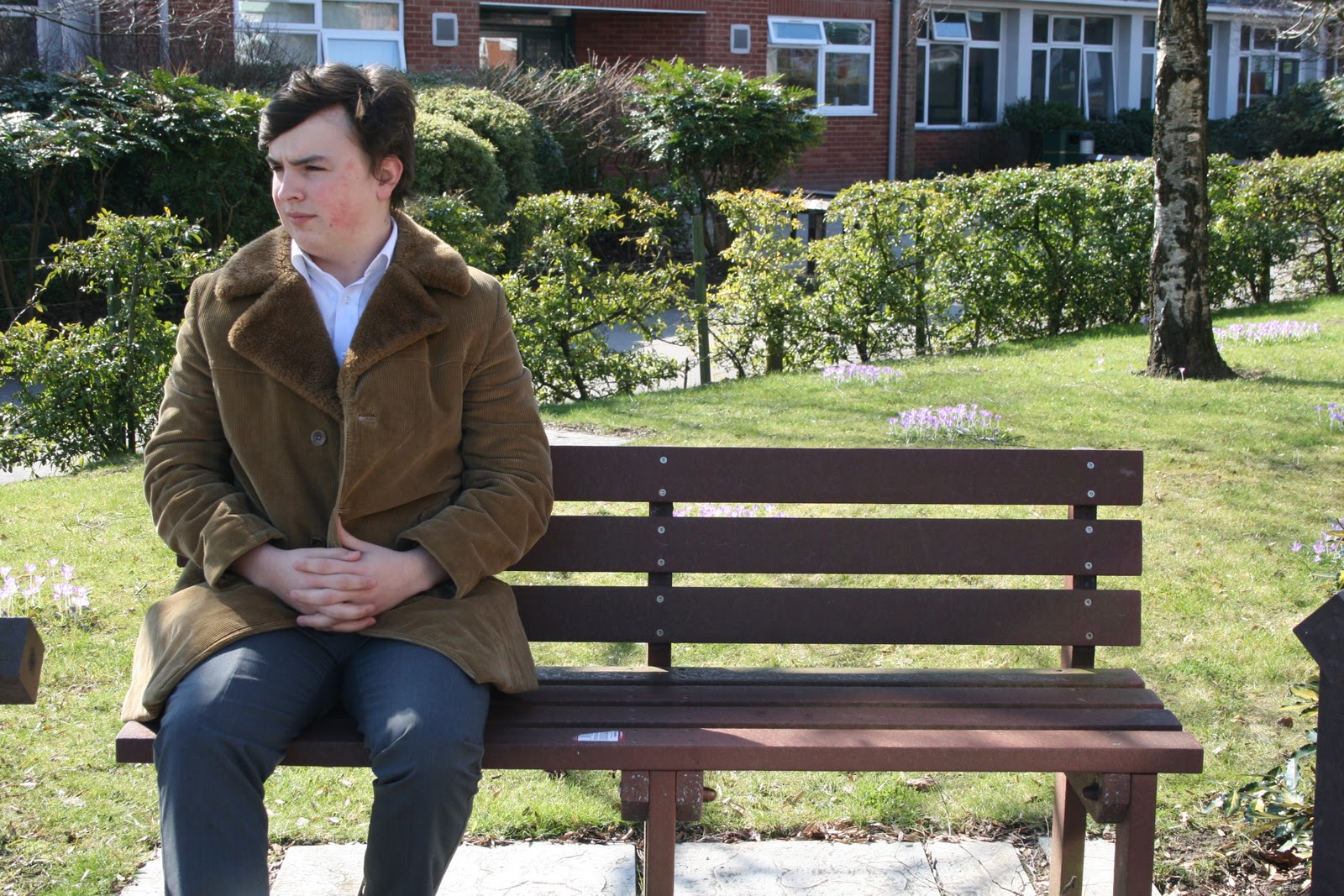
We are currently in the editing process of our short film. We had expected the train station scene to be longer as we had recorded some dialogue between Lucas and Grace which took place on the platform during this scene. However, as we are now using split screen to juxtapose the 2 parallel lives, we have had to cut this dialogue from our film. Instead, we have planned to include a short scene outside the train station where Lucas will have a quick chat to his old friend. Hopefully this will help to make our film more understandable to our demograph, as when scripting this dialogue we tried to make subtle references to a successful career life and a family life, hence implying the parallel lives incorporated in our short film.
Below is the script for this extra scene:
OUTSIDE THE TRAIN STATION – LUCAS RUNS INTO HIS OLD FRIEND.
FRIEND: You alright mate, ain’t seen you in a while, how’s things since the redundancy?  
LUCAS: Yeah not too bad thanks, I’m actually on the way to a job interview now, how’s things been with you?
F: well I’m still looking, haven’t found the right job yet but you know it’s been nice having some time off with the missus and kids.
L: Yeah I’m sure something will come up and I bet your kids have loved having you around, I guess I’m lucky I’ve only got to look after me.
F: Oh I bet it won’t be long till you have your own family, once you’ve met the right girl that is.
L: Yeah I hope so. 
F: Anyway, take care mate, don’t want you to miss your interview.
L: Yeah thanks, mate, cya soon, hope it all works out.

Wednesday 30 March 2011

Poster Feedback

We have showed our poster to lots of people to get some audience feedback.

Below is a list of the comments we got about our poster:

Positive:
·       Liked the bench feature – understood the idea of reflecting 2 personalities – 2 different lives
·       Thinks it reflects the plot of our film well – what we wanted
·       Liked the opaque image of the train station in the background – understood it must be an important part of our film
·       Liked how the background wasn’t white or a plain colour – the train station picture makes it interesting.
·       Liked how the bench was at the foreground, stands out, is the focus of the poster
·       Liked the font used for “Intersection”

Negative:
·       The hairline of our actor on the left needed editing as looked poor.
·       Maybe remove the black colouring behind the title.
·       Maybe a divide down the middle to show they are separate lives.

We reviewed the feedback which we got about our poster and have taken what was said it into consideration. We were happy with the positive feedback we received, as we were glad people thought our poster reflected our film well as that is what we had intended. We were also glad that many were interested to find out more about the split narratives, hence our poster was appealing to them and they would be interested in watching our film.

In relation to the negative points, we have adjusted the hairline of the image of our actor on the left within our poster, as many people commented on the fact his hair looked strange. We discussed the other negative points which were made, regarding the black colour behind the title, we felt it was needed due to the black ceiling in the train station picture behind it and also we felt that the black colouring helped the title to stand out more. Also, we tried including a split with the train track before to reiterate the separate lives; however we feel adding something else to our poster will make it more crowded and confusing for our demograph.

Final Poster

Monday 28 March 2011

Further Poster Progress

We have changed the previous white background of our poster, to a picture of a train; however we changed the opacity of this image, so the picture of our protagonist sitting on the bench is the main focus of the poster.

We also decided to omit the train track positioned in-between “Inter – section”, because we felt it did not look right and looked more like a ladder than a train track. Moreover, we enlarged the writing for the title of our film and put it in a white font with a black background behind it, so this way it is much more noticeable and easier for people to read.

We feel our poster looks much more professional now and we are happy with it. We are going to show it to people to hear their thoughts and opinions on it.

Our film poster

Friday 25 March 2011

Poster Progress

We have been making constant developments to our film poster. We have our main image of Lucas positioned on opposite ends of the bench, which is the main focus of the poster.
We have the title of our film “Intersection” at the top of our poster and when deciding on typography, after much discussion, we chose a font which we believe reflects the style of writing used on train station information boards, hence relates to the plotline of our film. Also, we had to keep in mind serif and sans serif fonts, as from our poster research, we noticed how more recent film posters include sans serif fonts, so we wanted to make sure we abide by this rule. Underneath our film name we have placed our tagline. It originally was: “Sometimes it’s the smallest decision which can change your life forever” yet we felt this was too long, so have now shortened it to: “The smallest decision can have the biggest change” and by employing the words “small” and “big”, binary opposition has been created.

We then decided upon separating the words ‘Inter – section’ by positioning a train track in-between the 2 words, reiterating the split narratives within our storyline. However, at the moment we feel the image does not look like a train track and more like a ladder and could be confusing to people, so is something we need to develop.

Additionally, we believe that currently our poster looks quite plain, due to the fact it’s on a white background. So, we have considered adding a slightly transparent picture of the train in the background.

At the bottom of the poster we have included important information about the film, including the production company, the actor’s names and the names of those who produced, edited and directed it. We have decided to put our film in association with Miramax Pictures, as they produced “Sliding Doors”, a film which we consider to be similar to ours. We have also included the logos for Miramax and our production company “Tick Tock Productions” at the bottom of our poster.

Our film poster currently

Wednesday 23 March 2011

Last Part of Filming

We have arranged our last part of filming for this weekend.

On Sunday morning we are filming the train station scene again. We have had numerous problems when filming this scene and have now resorted to filming off peak. Hopefully everything will go to plan this time, especially as we have planned in detail all the shots which we intend to capture and will make sure we get more shots than we actually need.

The only thing which we are slightly worried about is the dialogue. This is because this opening scene at the train station is the only section which includes dialogue, yet during the previous times when we have filmed this scene, the noise at the train station has always overpowered our non-diegetic dialogue. Therefore, we are going to make sure our actors speak with loud dynamics and that we hold our microphone as close as possible to our actors as we can. However, as we have added in the extra scene of Lucas getting ready for his interview – which will obviously be placed before the train station scene in our edit – we now feel the train station scene does not have to be as long. Therefore, we have considered omitting certain parts of the dialogue, as we feel it may be too long especially for the context of this scene.

Once we have re-shot this final scene our filming will then be complete. We can then concentrate completely on editing our film and perfecting our ancillary tasks. We also need to decide upon what diegetic music will be included within our film, as music is an important part which helps to reflect what is happening on screen.

Sunday 20 March 2011

Extra filming

In a recent group discussion we came to the conclusion that apart from the train station, our film includes a lot of fantasy elements. This is because the majority of our film consists of the alternative narratives which are flash forwards, hence are not real life. Therefore, we have decided to incorporate some other shots at the beginning of the film which portray a sense of reality. We plan to capture some footage of Lucas getting out of bed the morning of his interview, brushing his teeth, choosing which shirt to wear, eating breakfast and getting into his car; helping our demograph to connect more with our film and getting to know a bit more of Lucas’ background. When we edit this, we hope to intermingle these shots with our time lapse shot of the train station, reiterating the importance of the train station and involving the audience, as they are left wondering what is going to occur. We plan to capture these shots tomorrow at one of our houses.

Friday 18 March 2011

Film Review Progress

As well as creating a poster for our short film, for the other ancillary task we have to create a magazine review of our film.

I have arranged the layout for our film review. I have adopted an ‘Empire’ review style, by separating the text into the headings: ‘Plot’, ‘Review’ and ‘Verdict’. I felt this was a nice way to divide up the review and interesting and easy for readers to follow. Additionally, if the reader is skimming through the magazine quickly and is only interested in the verdict, they can easily pinpoint and read just that section.

I decided to include a fact file box as well, as it informs the readers about important details to do with the film, including rating, running time and actors involved.

The text of the review is not completed yet, as we have not actually finished editing our film, so as it is not finished, a full review of it cannot be made. However, I have inputted sentence starters and given the idea about topics which I wish to cover in the actual review. I also want to include a quote as well, as this is a typical convention of magazine style film reviews.

I have inserted some pictures from our film edit to our magazine review, one of Lucas and Grace together and one of Lucas in the successful life at his mansion. Not only do these pictures reflect the two different narratives of our film, they also show the different locations and characters involved within our film too. We also hope to include a picture of Lucas at the train station, as that is an essential setting within our short film.

At first we had just a plain white background and were going to choose another colour at a later stage. Yet after further research into magazine film reviews, we noticed how a lot of them actually incorporate a photo from the film as the background picture and we thought that would be a nice feature for our review too.

We chose the photo of Lucas in the successful life; however we may change this at a later stage to a photo of Lucas at the train station. Nevertheless, we feel with a photo set as the background, our review looks much more realistic.
First film review draft

Second film review draft


Wednesday 16 March 2011

Creation of our poster photo

We used Adobe Photoshop Elements 8 to create the photo which is featured on our poster.

First of all we chose our first picture of our protagonist sitting on the bench and cropped him out of that picture, placing him on our second picture of him sat on the bench, later aligning the images correctly so they matched. I then adjusted the brightness with the ‘dodge tool’, so that both images were the same colour. 


However, we did encounter a problem. As the bench was shaded by trees and it was a sunny day, when Lucas sat at different ends of the bench a shadow was created. This meant that the bench was a different colour in the separate pictures due to this shadow, although this was not noticed until we were aligning the pictures together. Therefore, I decided to use the ‘eyedropper tool’ to pick out the colour of the bench in one picture, so we could then apply that exact colour to the other parts of the bench where it had been affected by the shadow. However, by using this tool, it only picked up on a very flat colour and would not look realistic. So, I copied bits of the bench from the first picture and positioned them on the second picture to make the bench one consistent colour. 


Additionally, in some places it was obvious that we had cropped 2 pictures together, so I used the ‘smudge tool’, to make it look like more realistic and one individual picture.

We then decided that we did not want the background scenery to be seen on our poster. So we decided to use the ‘lasoo tool’, to only select the image of Lucas on the bench, thus discarding the background.

Now that we have just the image of Lucas on a bench against a white background, we can now add the name and tagline of our film, our actors and our production company all to our poster.

Here is a screen shot from when I was editing the picture in Adobe, you can see the problem we encountered of the bench being different colours due to the shadow.
The final picture

Our poster photo with a white background


Monday 14 March 2011

Recent filming and poster progression

We captured some shots for the successful narrative of our short film this morning. We filmed shots of Lucas in his office which included him talking on the phone, doing work on his computer and shots of him slightly stressed out, implying the moral of this narrative; that money doesn’t bring you happiness. Additionally, when deciding upon camera shots, we chose to get some low angle shots of Lucas to connote how he is quite a powerful character.

We also managed to take the new photos for our film poster and fortunately it was a sunny day. We took numerous photos of Lucas dressed in his causal and smart clothes whilst sitting at two opposite ends of a bench. In the successful life we decided to have him sat with good posture and conveying serious emotions, whereas for the family orientated life, we chose to have him sitting much more relaxed and smiling too.

Below are the photos which we believe are the best of Lucas representing each life. We will now use Photoshop Elements 8 in order to edit these pictures, so Lucas is sat at both ends of the bench.
Successful life Lucas
 
Family life Lucas


Wednesday 9 March 2011

Film Review Inspiration

I have previously researched The Guardian and Empire film reviews, making note of the structures, layouts and audiences, so I make sure I create the right style of review for our short film.
We feel Empire would be the right magazine for our review as it is read by the same demograph as those who would watch our film (18-35) and due to being a worldwide company, it can help with the promotion of our film.
As we can see with the ‘Inception’ review from Empire Online, they arrange it with a Plot, Review and Verdict structure, which we feel is a good way to layout our review. We believe it is easy for readers to follow as this way they can choose to read only certain sections if they wish to do so.  
Empire Online - Plot, Review and Verdict structure
Regarding the magazine versions of Empire, they still employ the same structure as the online versions. The review below incorporate still images from the film which is something we intend to do, as it will give the reader an insight into our short film and the locations and actors involved.
Empire Magazine Review - Use of still image from film
Some film reviews, for example the one below, has a still image from the film, set as the background of the review page with the text overlapping, which I feel is a nice feature. This review also includes other images as well, proving to be an interesting layout.
Empire Magazine Review - image set as background
Although we are adopting an Empire style film review, I did look at The Guardian film reviews, as they too are read by a wide audience, albeit it only British. The feature which The Guardian employed which we liked was the fact file box, as shown in the review of ‘The King’s Speech’ below.
The Guardian Review - Fact File box

Friday 4 March 2011

Poster Changes

We have decided to change our poster idea once again. We recently took photographs of our protagonist wearing casual and smart clothes. This is because on our poster, he will be featured wearing a suit on the left side of his body to reflect the business narrative of our film, and on the right side he is seen wearing casual clothes, representing the family orientated life of our film. However, after editing and merging the photos together, we feel that it looks quite amateur and is not right for our film. Therefore, we have now decided upon another poster concept. This will feature our main protagonist Lucas, where he will be visible at two ends of a bench. On one side of the bench he will be sitting in a suit reflecting the successful life and at the other end he will be sitting wearing casual clothes to represent the family narrative. We feel this will have the same effect as our other poster, as it reflects the two different narratives of our film, however it will hopefully look more professional than our other poster idea.
Our first poster idea

Wednesday 2 March 2011

Pictures for our Ancillary Task

We took photos for our film poster and are now going to use Adobe Photoshop to edit the pictures.
Casual Lucas
Successful Lucas

Tuesday 1 March 2011

Successful Life Filming

We filmed some scenes for Lucas’ successful life and after reviewing our footage, we are pleased with what we captured. We used one of our friend’s houses to film and we got interior and exterior shots of Lucas in his mansion. We hope to create the impression that although Lucas is very wealthy due to his successful career, he is always alone and these material objects do not bring him happiness.

We captured shots of Lucas alone inside and outside of his mansion and watching TV on his own. We also managed to film the opening the letter scene for this narrative for our film.

As we have edited all of the family orientated life scenes, we will now edit these successful life shots and will position them within our edit so the narratives alternate. Our film should now start to look more coherent.