Monday, 2 May 2011


Evaluation 4: How did you use new media technologies in the construction and research, planning and evaluation stages?
Create your own video slideshow at animoto.com.
We used a variety of media technologies in the research, planning, construction and evaluation stages of our three products.
Research
- We sed Empire Magazine to help with our research into film posters and film reviews. As we adopted the Empire – Plot, Review and Verdict structure to our film review.
- We used YouTube to research into other similar films to get inspiration and to grasp the conventions of short films. This included looking at the films such as: Sliding Doors, Memento and The Family Man. We also used YouTube to look at editing techniques which we wanted to apply to our short film, for example the time lapse shot in The Script’s music video, slow motion from The Matrix and the rewind effect from Coldplay’s music video. Additionally we used YouTube during the planning stages of our production as we made some vlogs about the filming of certain scenes. We also used YouTube as a great tool when conducting our evaluations as by uploading our short film to there, we could receive feedback on how effective our final product was from our demograph.
- We used the website IMDB to research into short films and film posters and also used it to get an idea of which production companies would work with us to produce our film.
- We went to the cinema a couple of a times as a group to watch films to get inspiration, for example we went to see the film ‘Inception’, which encouraged our decision for the ending of our film where we leave it on a cliff-hanger so the audience can decide the outcome.
- We used scripped.com to help with the creation of our script for our short film.
- We used blogger to update our blogs regularly, keeping us organised and up to date on our planning and the progression of our short film and the two ancillary products.
- We used the BBC weather site to check the weather before organising filming for the exterior locations and Microsoft Word to organise filming schedules.
- Regarding the construction of our three products, we used Adobe Premier Pro to edit our short film, Adobe Photoshop to create our poster and Microsoft Publisher to create our film review. These are programmes which we had used last year, hence were familiar with them, yet still experimented much more, as included lots of features to make our film more interesting and appropriate for our demograph, for example: the time lapse, the slow motion, the change of colour and the split screen effect.
- In relation to the music within our film, we used Apple’s Garage Band to create some non-diegetic music yet also used the website freesound.org to add other diegetic sound to our film.
Evaluation
- We uploaded our film to YouTube and then posted the link on the social networking site Facebook to receive audience feedback, hence indicating the convergence of 2 mediums. We also uploaded an image of our poster to Facebook too and by doing this we could receive direct feedback from our demograph. Additionally, with the use of social networking sites being worldwide we could receive feedback on our products from people from other countries, thus helping our film to become international. So, although our film was intended for a British audience, people from America gave us positive feedback on it, probably due to it being regarded by them as a quintessentially English film, hence a type of cultural imperialism.
- For the evaluation tasks we used websites such as Animoto, wix.com, and Prezi, proving to be creative ways to analyse our products.
Equipment
- Canon 400D Still Camera to capture photos when we went location hunting and to capture the images for our poster.
- PC and Mac to edit our film and create the non-diegetic music
- Sony HD camcorder to capture the footage for our short film.
Therefore, new technologies can be seen as very important as have helped us in all stages of the production of our 3 products, with the internet being a key element in the whole process, as it contributed to all stages of completing our product and without it, it would have hindered our progress.
Evaluation 2: How effective is the combination of your main product and ancillary texts?
In conclusion
The train station is the main location within our short film as is where disequilibrium occurs. Therefore, as it is a pivotal part of our film, we made sure to include it on our poster and in our film review. Thus, consistency to do with the train station has been achieved in all three products as we incorporated the train station as the background image to our poster, it is seen as a still image on our film review and of course it is the central location within our short film.
We kept the mise-en-scene the same through all three products, helping to construct verisimilitude. When we organised the photo shoot to capture the images for our poster, we made sure our protagonist wore the same clothing to what he had been wearing whilst filming, hence creating continuity.
We also made our actor have the same facial expressions in the poster and in the film, creating continuity between those products. This is because, in the successful life of the film where Lucas is lonely, his facial expression conveys him as being sad and depressed. Therefore, when capturing the successful life photo of him for our poster, we made sure he kept this same sad facial expression. However, in the family life of our film he is see much more happier and this is also portrayed in the family life picture of him in the poster, as we got him smiling and sitting much more casually.
In our film we juxtapose the parallel lives with the use of split screen and in our poster we made a duplicate image of our protagonist side by side, hence contrasting the 2 different lives he could lead in both the poster and our film.
Black has been a common colour for our products, as is consistent in all three. In our film our production company name and our film name all appear on a black background with white typography. For our poster, the title is seen with a black background and white font too and in our film review we have a black border accompanied with white font. Therefore, we have kept this black on white theme consistent in all three of our products as we believe these colours fit with the drama genre.
Our film and the review were consistent in the way we included pictures from our film within our review. We chose to do this as we thought that way when people are reading our review, they can get an insight into our film, as the images included are still shots from our film. Also, we made sure to include pictures of both of the parallel lives as well as the train station.
Another similarity is that both our poster and film review make use of our tagline: “The smallest decision can make the biggest change”. We made sure to include this in these 2 products as this is something which will help to promote our film and is unique to our film.
The final point which is similar in all 3 is that none of our products reveal too much information. For example, our film is left on a cliff hanger leaving the audience to make their decision. Our poster hints at the parallel narratives with the duplicate image of our protagonist on the bench. Also, our film review talks about our film but doesn’t spoil it for the audience.
Evaluation 1: In what ways does your media product use, develop or challenge forms and conventions of real media products?
In relation to this evaluation question, we created a website: http://www.wix.com/honor_mcadam/intersectionevaluationtask
 |
| Website Homepage |
Film
- We believe that our film develops drama genre film conventions due to having a structured plotline which is understandable and can be linked to the film Sliding Doors which was our inspiration.
- We believe it may challenge film conventions by the way there is limited dialogue which is unusual for short films, yet again this is linked to the fact our film consists only around one main protagonist.
- The ending can also be seen as challenging film conventions due to the way it is left on a cliff-hanger, whereas most films these days have a definite ending.
 |
| Film page on website |
Poster
- We researched into film posters and discovered how the bench feature is a convention of rom-com films. Although our film is of a drama genre, it does have an element of romance, so our film poster does conform to this convention.
- Regarding our poster, something which challenges poster conventions could be the opaque train background image, as most film posters have a solid image, whereas we wanted to reinforce how the train station was an important part of our film, yet wanted the focus to be on the bench feature.
 |
| Poster page on website |
Review
- Our film review conforms to the conventions of published film reviews, especially as it adopts a Plot, Review and Verdict structure like Empire magazines.
- It may possibly challenge film review conventions with the way it doesn’t include any features which indicate it is an extract from a magazine, like “also in this edition…” and “turn over to find out…”. However, we felt this was not necessary and that our film review has a good style to it.
 |
| Film review page on wesbite |
Wednesday, 6 April 2011
Editing of our short film
We have been editing our short film using Adobe Premier Pro. We are very happy with the opening scene, which includes our time lapse shot of the train station, which cross-cuts constantly to shots of Lucas getting ready to go to his job interview. The train station scene is where Lucas has to make the decision, so we have reinforced the 2 choices by the use of split screen; juxtaposing the 2 choices. The parallel narratives which indicate the two separate lives that Lucas could lead were the part of our film which we were having difficulties with when editing. This is because; first of all we had placed a shot of the successful life, followed by a shot of the family orientated life, hence contrasting the lives. However, when we showed it to some people, they could not understand that it was 2 different lives. We then decided upon changing the successful life to black and white, as in that life Lucas is lonely so this duller tone would relate to that and would also help to make the 2 parallel lives clearer. However, when showing it again for feedback, people still failed to understand. Therefore, we decided to show the flash forward of the successful life, return to reality and then have the flash forward of the family life, yet still incorporating the use of black and white. As we had planned to include a fast rewind at the end of the flash forward, we have now chosen to rewind each life separately before Lucas returns to reality. Additionally, as we have now separated the lives, we decided to cut the opening the card scene from the edit, as it would no longer make sense. We also included slow motion in some areas, for example when Grace bumps into someone at the train station, as we felt it is a pivotal part of our short film, as her bumping into someone is what makes Lucas have to make a decision; whether to ignore her or help her – which changes his life – and is the centre of our film. Towards the end of the film, Lucas looks left and right; contemplating the choices, before it cuts to a shot of his foot taking a step. We decided to slow this part down too, as it attracts the attention of the audience, as they will keep watching to see what decision he makes. We tried out various special effects, as we wanted to make the flash-forward’s look like fantasy and not reality. However, we were not happy with the effects, as they created more ghost like effects rather than the effect we were after. Therefore, we decided that a white flash accompanied by appropriate non-diegetic sound will indicate it’s a flash forward and in between the shots during the flash forwards we employed ‘dip to whites’ as the transition, as this too helps to convey fantasy. We did capture a vast amount of footage; much more than we actually needed, especially for the flash forward scenes. However during the editing process, we only used short clips, as we did not want it to be boring for our demograph and we thought how flash forwards are normally just quick snippets, thus not revealing too much detail. During the flash forwards especially in the family life, at first we did incorporate dialogue; when he said “will you marry me” and during the argument scene. We changed the pitch of the diegetic dialogue, so it had a slight echo affect to it, reiterating how it is fantasy and not real. However, after reviewing it, we felt the argument scene was not needed, so cut that from our edit. We then thought only having dialogue for the proposal scene would be strange, so we decided to remove it, as from the shots it is obvious what is happening and we believe it looks more effective with just non-diegetic music and no dialogue.
Tuesday, 5 April 2011
Voiceovers
We have decided to include a short voiceover from Lucas’ perspective during the beginning part of our film. This will help to set the context and make it clearer to the audience where our protagonist is going. Also, it will make it understandable to our demograph that our film revolves around the fact Lucas is going to have to make a life changing decision.
Our voiceover for the beginning:
“We make many decisions everyday without a second thought; whether to have tea or coffee, what clothes to wear and what to have for dinner, but I never knew that the small decision I would make later this morning, would have such life changing consequences.”
Additionally, after our demograph recently reviewed an edit of our film, we got the impression that they found the flash forwards slightly boring, as although it was accompanied by relevant non-diegetic music, no dialogue is present in those scenes. Therefore, we have decided to include two voiceovers; one to go with the successful life and one for the family life. We believe this is an improvement to our film, as not only does it add more depth but also helps to make the plot slightly clearer for our audience as differentiates the two parallel lives more. Below is what we have scripted for the 2 voiceovers, but we intend to separate certain lines so they are heard in relation to certain on-screen actions. For example: the line “the perfect women” will accompany the shot of Lucas and Grace kissing and the line “nights at home in front of the telly” will accompany the shot of them watching TV together.
Voiceover for the successful life:
"I had the perfect job, the perfect house, the perfect lifestyle. It’s everyones dream to live a successful life like this, but as perfect as it was, I wasn’t happy, I was lonely. Getting on the train that day and getting this job has turned my life around. But money certainly isn’t everything, as what’s a great life when you have no one to share it with?"
"I had the perfect job, the perfect house, the perfect lifestyle. It’s everyones dream to live a successful life like this, but as perfect as it was, I wasn’t happy, I was lonely. Getting on the train that day and getting this job has turned my life around. But money certainly isn’t everything, as what’s a great life when you have no one to share it with?"
Voiceover for the family life:
"I may not have had the perfect job or the perfect house, but I had the perfect woman. I was living the family life everyone dreams of and I couldn’t be happier. It was the little things that I loved the most; from walks on the beach to nights at home in front of the telly. Who would have thought that this woman at the train station would end up being my wife? "
"I may not have had the perfect job or the perfect house, but I had the perfect woman. I was living the family life everyone dreams of and I couldn’t be happier. It was the little things that I loved the most; from walks on the beach to nights at home in front of the telly. Who would have thought that this woman at the train station would end up being my wife? "
Monday, 4 April 2011
Music for our short film
Regarding non-diegetic music for our short film, we have used Apple’s GarageBand to create the music. First of all we did hope to have a local band or singer do an acoustic version of a song about making decisions hence would relate to the storyline of our film, yet this was proving difficult to organise.
We created 4 different non-diegetic music tracks for our short film. The first piece of music is played during the opening of our film where we cross-cut between the train station time lapse shot and the shots of Lucas getting ready. We believe the music we have created fits well here, as it has the feeling of a new day. The second piece of music accompanies the flash forward of the successful life; here we created a slow piece of piano music in a minor tone. We felt this suited the context of the successful life, as although Lucas has a good career, he is rather lonely and unhappy. In contrast, for the family orientated life, we created a much happier and livelier piece of music, thus reflecting that lifestyle. For the rewinds of both of the flash forwards, we used the same piece of music to keep consistency and this emphasised that what Lucas had just seen was rewinding in his mind. For this we chose quite a fast piece of music that had good momentum, hence reiterating a rewind. We also accompanied the rewinds with the sound of a tape being rewound, as we thought this would help to emphasise what is occurring on screen. The first piece of music is then heard again when we see the footstep, signalling the end of the film and carries on throughout the credits.
We are also using the website www.freesound.org to add further diegetic sounds to our film, for example the sound of waves during the beach scene and bird noises for the scenes outside.
Friday, 1 April 2011
Film Review
We have created our film review for our short film as one of the ancillary tasks. Regarding the writing of our review, I have written it in the style of an ‘Empire’ film review; including the subheadings of: Plot, Review and Verdict. However I have been critical of our short film in the way I have subtly indicated what we believe to be some of the flaws of ‘Intersection’.
 |
| Our Film Review |
Thursday, 31 March 2011
Additional Dialogue Scene
We are currently in the editing process of our short film. We had expected the train station scene to be longer as we had recorded some dialogue between Lucas and Grace which took place on the platform during this scene. However, as we are now using split screen to juxtapose the 2 parallel lives, we have had to cut this dialogue from our film. Instead, we have planned to include a short scene outside the train station where Lucas will have a quick chat to his old friend. Hopefully this will help to make our film more understandable to our demograph, as when scripting this dialogue we tried to make subtle references to a successful career life and a family life, hence implying the parallel lives incorporated in our short film.
Below is the script for this extra scene:
OUTSIDE THE TRAIN STATION – LUCAS RUNS INTO HIS OLD FRIEND.
FRIEND: You alright mate, ain’t seen you in a while, how’s things since the redundancy?
LUCAS: Yeah not too bad thanks, I’m actually on the way to a job interview now, how’s things been with you?
F: well I’m still looking, haven’t found the right job yet but you know it’s been nice having some time off with the missus and kids.
L: Yeah I’m sure something will come up and I bet your kids have loved having you around, I guess I’m lucky I’ve only got to look after me.
F: Oh I bet it won’t be long till you have your own family, once you’ve met the right girl that is.
L: Yeah I hope so.
F: Anyway, take care mate, don’t want you to miss your interview.
L: Yeah thanks, mate, cya soon, hope it all works out.
Wednesday, 30 March 2011
Poster Feedback
We have showed our poster to lots of people to get some audience feedback.
Below is a list of the comments we got about our poster:
Positive:
· Liked the bench feature – understood the idea of reflecting 2 personalities – 2 different lives
· Thinks it reflects the plot of our film well – what we wanted
· Liked the opaque image of the train station in the background – understood it must be an important part of our film
· Liked how the background wasn’t white or a plain colour – the train station picture makes it interesting.
· Liked how the bench was at the foreground, stands out, is the focus of the poster
· Liked the font used for “Intersection”
Negative:
· The hairline of our actor on the left needed editing as looked poor.
· Maybe remove the black colouring behind the title.
· Maybe a divide down the middle to show they are separate lives.
We reviewed the feedback which we got about our poster and have taken what was said it into consideration. We were happy with the positive feedback we received, as we were glad people thought our poster reflected our film well as that is what we had intended. We were also glad that many were interested to find out more about the split narratives, hence our poster was appealing to them and they would be interested in watching our film.
In relation to the negative points, we have adjusted the hairline of the image of our actor on the left within our poster, as many people commented on the fact his hair looked strange. We discussed the other negative points which were made, regarding the black colour behind the title, we felt it was needed due to the black ceiling in the train station picture behind it and also we felt that the black colouring helped the title to stand out more. Also, we tried including a split with the train track before to reiterate the separate lives; however we feel adding something else to our poster will make it more crowded and confusing for our demograph.
 |
| Final Poster |
Monday, 28 March 2011
Further Poster Progress
We have changed the previous white background of our poster, to a picture of a train; however we changed the opacity of this image, so the picture of our protagonist sitting on the bench is the main focus of the poster.
We also decided to omit the train track positioned in-between “Inter – section”, because we felt it did not look right and looked more like a ladder than a train track. Moreover, we enlarged the writing for the title of our film and put it in a white font with a black background behind it, so this way it is much more noticeable and easier for people to read.
We feel our poster looks much more professional now and we are happy with it. We are going to show it to people to hear their thoughts and opinions on it.
 |
| Our film poster |
Friday, 25 March 2011
Poster Progress
We have been making constant developments to our film poster. We have our main image of Lucas positioned on opposite ends of the bench, which is the main focus of the poster.
We have the title of our film “Intersection” at the top of our poster and when deciding on typography, after much discussion, we chose a font which we believe reflects the style of writing used on train station information boards, hence relates to the plotline of our film. Also, we had to keep in mind serif and sans serif fonts, as from our poster research, we noticed how more recent film posters include sans serif fonts, so we wanted to make sure we abide by this rule. Underneath our film name we have placed our tagline. It originally was: “Sometimes it’s the smallest decision which can change your life forever” yet we felt this was too long, so have now shortened it to: “The smallest decision can have the biggest change” and by employing the words “small” and “big”, binary opposition has been created.
We then decided upon separating the words ‘Inter – section’ by positioning a train track in-between the 2 words, reiterating the split narratives within our storyline. However, at the moment we feel the image does not look like a train track and more like a ladder and could be confusing to people, so is something we need to develop.
Additionally, we believe that currently our poster looks quite plain, due to the fact it’s on a white background. So, we have considered adding a slightly transparent picture of the train in the background.
At the bottom of the poster we have included important information about the film, including the production company, the actor’s names and the names of those who produced, edited and directed it. We have decided to put our film in association with Miramax Pictures, as they produced “Sliding Doors”, a film which we consider to be similar to ours. We have also included the logos for Miramax and our production company “Tick Tock Productions” at the bottom of our poster.
 |
| Our film poster currently |
Wednesday, 23 March 2011
Last Part of Filming
We have arranged our last part of filming for this weekend.
On Sunday morning we are filming the train station scene again. We have had numerous problems when filming this scene and have now resorted to filming off peak. Hopefully everything will go to plan this time, especially as we have planned in detail all the shots which we intend to capture and will make sure we get more shots than we actually need.
The only thing which we are slightly worried about is the dialogue. This is because this opening scene at the train station is the only section which includes dialogue, yet during the previous times when we have filmed this scene, the noise at the train station has always overpowered our non-diegetic dialogue. Therefore, we are going to make sure our actors speak with loud dynamics and that we hold our microphone as close as possible to our actors as we can. However, as we have added in the extra scene of Lucas getting ready for his interview – which will obviously be placed before the train station scene in our edit – we now feel the train station scene does not have to be as long. Therefore, we have considered omitting certain parts of the dialogue, as we feel it may be too long especially for the context of this scene.
Once we have re-shot this final scene our filming will then be complete. We can then concentrate completely on editing our film and perfecting our ancillary tasks. We also need to decide upon what diegetic music will be included within our film, as music is an important part which helps to reflect what is happening on screen.
Sunday, 20 March 2011
Extra filming
In a recent group discussion we came to the conclusion that apart from the train station, our film includes a lot of fantasy elements. This is because the majority of our film consists of the alternative narratives which are flash forwards, hence are not real life. Therefore, we have decided to incorporate some other shots at the beginning of the film which portray a sense of reality. We plan to capture some footage of Lucas getting out of bed the morning of his interview, brushing his teeth, choosing which shirt to wear, eating breakfast and getting into his car; helping our demograph to connect more with our film and getting to know a bit more of Lucas’ background. When we edit this, we hope to intermingle these shots with our time lapse shot of the train station, reiterating the importance of the train station and involving the audience, as they are left wondering what is going to occur. We plan to capture these shots tomorrow at one of our houses.
Friday, 18 March 2011
Film Review Progress
As well as creating a poster for our short film, for the other ancillary task we have to create a magazine review of our film.
I have arranged the layout for our film review. I have adopted an ‘Empire’ review style, by separating the text into the headings: ‘Plot’, ‘Review’ and ‘Verdict’. I felt this was a nice way to divide up the review and interesting and easy for readers to follow. Additionally, if the reader is skimming through the magazine quickly and is only interested in the verdict, they can easily pinpoint and read just that section.
I decided to include a fact file box as well, as it informs the readers about important details to do with the film, including rating, running time and actors involved.
The text of the review is not completed yet, as we have not actually finished editing our film, so as it is not finished, a full review of it cannot be made. However, I have inputted sentence starters and given the idea about topics which I wish to cover in the actual review. I also want to include a quote as well, as this is a typical convention of magazine style film reviews.
I have inserted some pictures from our film edit to our magazine review, one of Lucas and Grace together and one of Lucas in the successful life at his mansion. Not only do these pictures reflect the two different narratives of our film, they also show the different locations and characters involved within our film too. We also hope to include a picture of Lucas at the train station, as that is an essential setting within our short film.
At first we had just a plain white background and were going to choose another colour at a later stage. Yet after further research into magazine film reviews, we noticed how a lot of them actually incorporate a photo from the film as the background picture and we thought that would be a nice feature for our review too.
We chose the photo of Lucas in the successful life; however we may change this at a later stage to a photo of Lucas at the train station. Nevertheless, we feel with a photo set as the background, our review looks much more realistic.
 |
| First film review draft |
 |
| Second film review draft |
Wednesday, 16 March 2011
Creation of our poster photo
We used Adobe Photoshop Elements 8 to create the photo which is featured on our poster.
First of all we chose our first picture of our protagonist sitting on the bench and cropped him out of that picture, placing him on our second picture of him sat on the bench, later aligning the images correctly so they matched. I then adjusted the brightness with the ‘dodge tool’, so that both images were the same colour.

However, we did encounter a problem. As the bench was shaded by trees and it was a sunny day, when Lucas sat at different ends of the bench a shadow was created. This meant that the bench was a different colour in the separate pictures due to this shadow, although this was not noticed until we were aligning the pictures together. Therefore, I decided to use the ‘eyedropper tool’ to pick out the colour of the bench in one picture, so we could then apply that exact colour to the other parts of the bench where it had been affected by the shadow. However, by using this tool, it only picked up on a very flat colour and would not look realistic. So, I copied bits of the bench from the first picture and positioned them on the second picture to make the bench one consistent colour.

Additionally, in some places it was obvious that we had cropped 2 pictures together, so I used the ‘smudge tool’, to make it look like more realistic and one individual picture.
We then decided that we did not want the background scenery to be seen on our poster. So we decided to use the ‘lasoo tool’, to only select the image of Lucas on the bench, thus discarding the background.
Now that we have just the image of Lucas on a bench against a white background, we can now add the name and tagline of our film, our actors and our production company all to our poster.
 |
Here is a screen shot from when I was editing the picture in Adobe, you can see the problem we encountered of the bench being different colours due to the shadow. |
 |
| The final picture |
 |
| Our poster photo with a white background |
Monday, 14 March 2011
Recent filming and poster progression
We captured some shots for the successful narrative of our short film this morning. We filmed shots of Lucas in his office which included him talking on the phone, doing work on his computer and shots of him slightly stressed out, implying the moral of this narrative; that money doesn’t bring you happiness. Additionally, when deciding upon camera shots, we chose to get some low angle shots of Lucas to connote how he is quite a powerful character.
We also managed to take the new photos for our film poster and fortunately it was a sunny day. We took numerous photos of Lucas dressed in his causal and smart clothes whilst sitting at two opposite ends of a bench. In the successful life we decided to have him sat with good posture and conveying serious emotions, whereas for the family orientated life, we chose to have him sitting much more relaxed and smiling too.
Below are the photos which we believe are the best of Lucas representing each life. We will now use Photoshop Elements 8 in order to edit these pictures, so Lucas is sat at both ends of the bench.
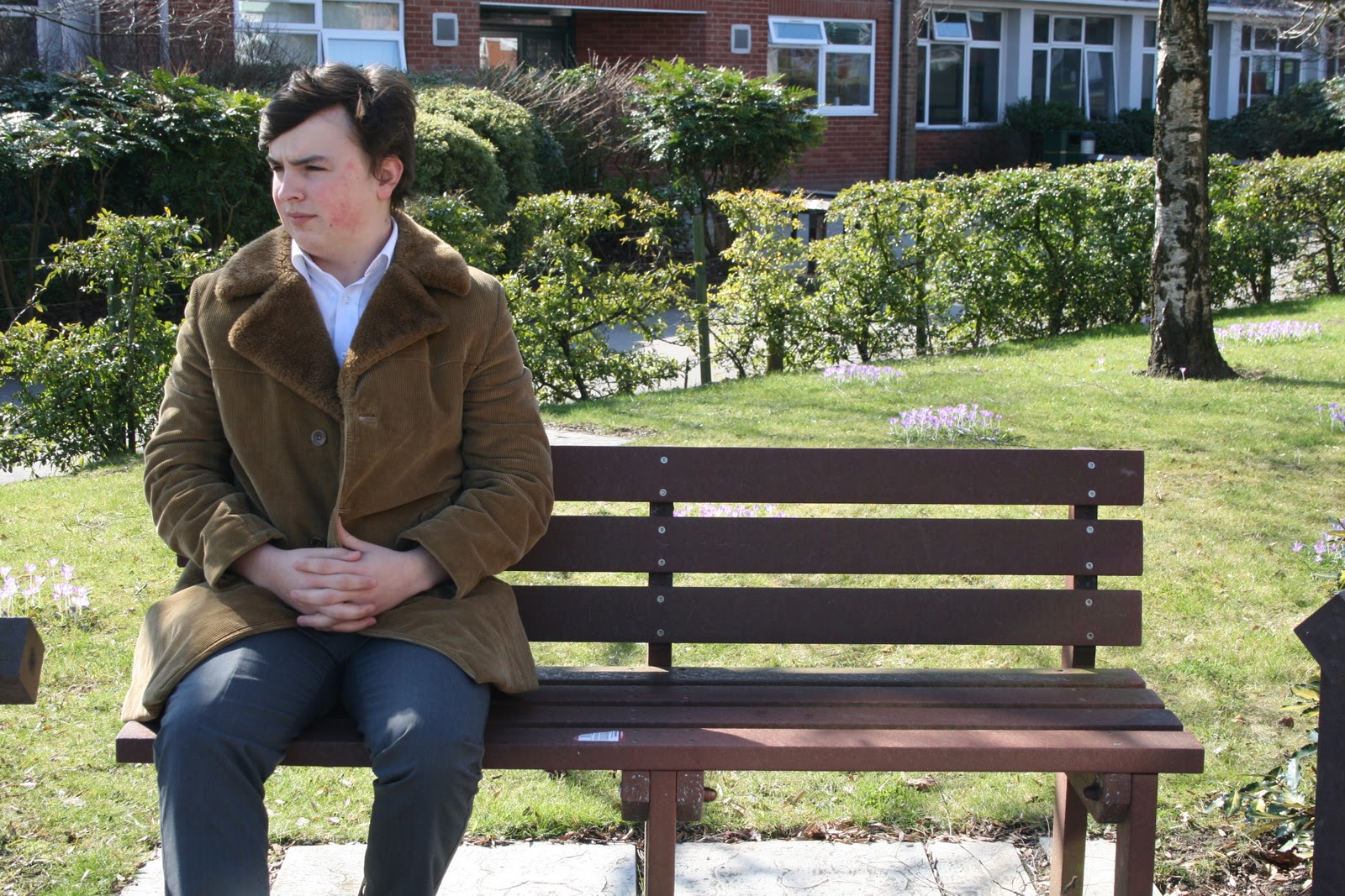 |
| Successful life Lucas |
 |
| Family life Lucas |
Wednesday, 9 March 2011
Film Review Inspiration
I have previously researched The Guardian and Empire film reviews, making note of the structures, layouts and audiences, so I make sure I create the right style of review for our short film.
We feel Empire would be the right magazine for our review as it is read by the same demograph as those who would watch our film (18-35) and due to being a worldwide company, it can help with the promotion of our film.
As we can see with the ‘Inception’ review from Empire Online, they arrange it with a Plot, Review and Verdict structure, which we feel is a good way to layout our review. We believe it is easy for readers to follow as this way they can choose to read only certain sections if they wish to do so.
 |
| Empire Online - Plot, Review and Verdict structure |
 |
| Empire Magazine Review - Use of still image from film |
Some film reviews, for example the one below, has a still image from the film, set as the background of the review page with the text overlapping, which I feel is a nice feature. This review also includes other images as well, proving to be an interesting layout.
 |
| Empire Magazine Review - image set as background |
 |
| The Guardian Review - Fact File box |
Friday, 4 March 2011
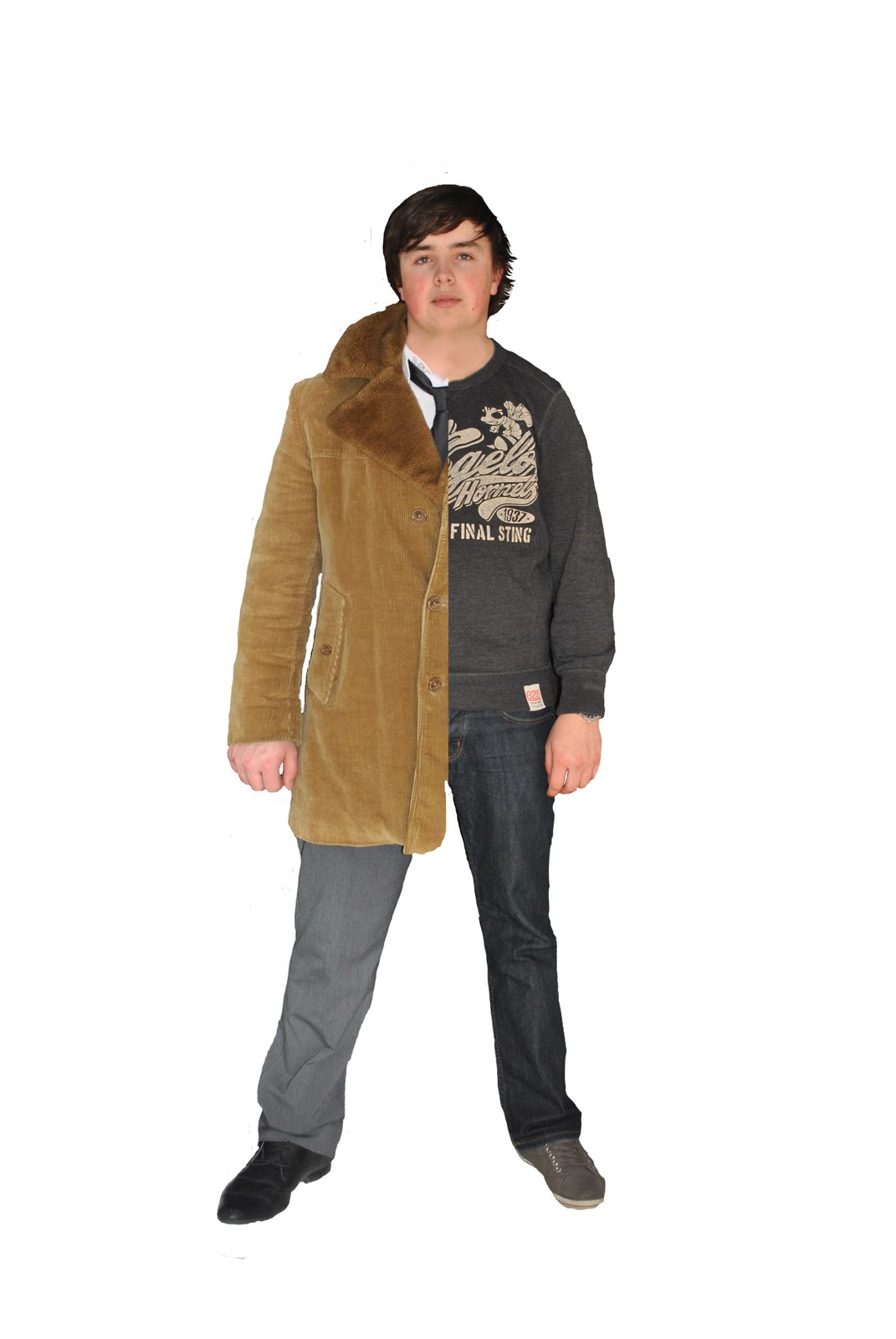
Poster Changes
We have decided to change our poster idea once again. We recently took photographs of our protagonist wearing casual and smart clothes. This is because on our poster, he will be featured wearing a suit on the left side of his body to reflect the business narrative of our film, and on the right side he is seen wearing casual clothes, representing the family orientated life of our film. However, after editing and merging the photos together, we feel that it looks quite amateur and is not right for our film. Therefore, we have now decided upon another poster concept. This will feature our main protagonist Lucas, where he will be visible at two ends of a bench. On one side of the bench he will be sitting in a suit reflecting the successful life and at the other end he will be sitting wearing casual clothes to represent the family narrative. We feel this will have the same effect as our other poster, as it reflects the two different narratives of our film, however it will hopefully look more professional than our other poster idea.
 |
| Our first poster idea |
Wednesday, 2 March 2011
Pictures for our Ancillary Task
We took photos for our film poster and are now going to use Adobe Photoshop to edit the pictures.
 |
| Casual Lucas |
 |
| Successful Lucas |
Tuesday, 1 March 2011
Successful Life Filming
We filmed some scenes for Lucas’ successful life and after reviewing our footage, we are pleased with what we captured. We used one of our friend’s houses to film and we got interior and exterior shots of Lucas in his mansion. We hope to create the impression that although Lucas is very wealthy due to his successful career, he is always alone and these material objects do not bring him happiness.
We captured shots of Lucas alone inside and outside of his mansion and watching TV on his own. We also managed to film the opening the letter scene for this narrative for our film.
As we have edited all of the family orientated life scenes, we will now edit these successful life shots and will position them within our edit so the narratives alternate. Our film should now start to look more coherent.
Saturday, 19 February 2011
Poster research
Our poster is an important part for the marketing and distribution of our film, as it will help to persuade people to come and watch it. We want our poster to not only being interesting so it attracts our demograph, but also relate to the storyline of our film. Our poster will not only include our main protagonist, but also the title and tagline of our film, our production company and our actors. The proxemics of the protagonists on the poster is something we must consider as will help to convey messages about our film.
We have already looked at the posters of “Sliding Doors” and “Memento” as they are similar to our short film. We particularly liked the layout of the “Sliding Doors” poster as it reflects the 2 parallel narratives within the film.
 |
| How to Lose a Guy in 10 Days - Poster |
This poster for “How to Lose a Guy in 10 Days”, consists of the 2 main protagonists, leaning on each other back to back, with them being the focus of the poster. The concept of them leaning on each and being back to back is quite a common convention of rom-com posters and is quite a simple yet effective idea. They are both relatively famous actors, so their names are included in quite a big font, as the fact they are very well known is also helping to promote that film. However, with our film, our actors are of course not big Hollywood names, so we do not have that advantage. The positioning of the actors and the title of this film connote the genre of romance, signalling that it is intended for a female demograph. The poster has a colour scheme of red and green which goes very well with background and the title is positioned effectively in between both the actors with the tagline positioned at the bottom of the poster. We could maybe incorporate this style of poster to ours, with Lucas stood back to back with the successful version of him and the family version of him.
 |
| Ghost Town - Poster |
The poster for “Ghost Town” is an interesting poster and reveals quite a bit about the film, something which we want our poster to do. From the background scenery we can tell it is set in NYC and the use of the bench is an interesting way to position the 2 protagonists of the film. The tagline and the main photo relates to the plot of the film and the very light gradient used also corresponds with this ‘ghost’ theme. We could incorporate a bench within our poster, as it is quite a simple yet effective idea.
This poster for “Mission: Impossible” is an effective idea and uses the distinctive face of their very famous actor to their advantage. Nevertheless, we are not able to create our poster in a similar style to this one, due to the fact the actors of our film are not well known, unlike Tom Cruise.
 |
| Mission: Impossible - Poster |
 |
| Titanic - Poster |
The poster for “Titanic” includes a close up embrace between the two famous actors within that film, relating to the romance issues of this film, yet their facial expressions convey a sense of sadness, relating to the tragedy within the plotline as well. The other prominent image of the poster is the ship, which of course is what the film is about and named after. As in our short film the train station is the place where Lucas experiences his visions, a train on the front of our poster would be relevant and is a possibility.
 |
| The Happening - Poster |
The poster for the film “The Happening”, is very clever and interesting, although it is a different genre to our film. This poster connotes the genre of horror/thriller and gives the impression that it’s going to be quite a fast paced action style film, with some element of tragedy implied. The protagonist’s name is featured on the poster as well as the tagline and the film name in quite a simple font style. Additionally, the choice of the cold blue/ dark tone reflects the genre of the film and mood of the plotline.
Thursday, 17 February 2011
Ancillary Task: Film Review research
As I am creating one of our ancillary tasks; the film review, I have researched film reviews from other publications, in order to help me adopt the correct style of writing for the review of our short film.
I chose to look in detail at two different publications: Empire Magazine and The Guardian’s film reviews, to give me ideas on the best way to approach our film review. When reading reviews by these publications, I noticed how they both apply a different format and style of writing to their reviews and there were certain features of both which I want to incorporate within our film review.
Empire is the world’s leading movie magazine and it sets out its reviews in three sections: Plot, Review and Verdict, something which I felt was an interesting arrangement and easy for the audience to follow and read. The Guardian, on the other hand, does not have a set structure and its layout is much more like a newspaper article, although it does incorporate a fact file box, stating interesting facts about the film it is reviewing. It should be taken into consideration how Empire and The Guardian are created for two very different audiences, hence why there are differences within their writing styles and layouts. The Guardian is more likely to appeal to the middle class and only to a British audience, as is a British newspaper, whereas Empire is a much more global magazine, for a younger audience than The Guardian’s.
As our film has the target audience of 18-35 year olds, we need to keep that in mind when creating our film review. We believe that Empire Magazine would be a good place for our film review to be published, as it would help to promote our film worldwide and we suppose our demograph are more likely to read that type of magazine. Additionally, as we consider that our film will appeal to women more than men due to the fact it is a drama and relates to emotions and making choices, traits more associated with females; then a women’s magazine would also be a good place for us to publish our review as this would directly reach our intended demograph.
Hopefully we will create a film review that will interest and persuade our demograph into choosing to watch our short film.
Wednesday, 16 February 2011
Filming plans
We are filming the time lapse shot for our short film on Friday morning from 8:30-9:30. When filming the other scenes situated at the train station, we discovered that it is very difficult to film on the bridge separating the train station platforms, especially when we are filming at rush hour times. Therefore, we are fortunate that from the dual carriageway we are able to view the train station, so we are hoping to capture our time lapse shot on the footpath where the red arrow is.

Subscribe to:
Posts (Atom)