Our poster is an important part for the marketing and distribution of our film, as it will help to persuade people to come and watch it. We want our poster to not only being interesting so it attracts our demograph, but also relate to the storyline of our film. Our poster will not only include our main protagonist, but also the title and tagline of our film, our production company and our actors. The proxemics of the protagonists on the poster is something we must consider as will help to convey messages about our film.
We have already looked at the posters of “Sliding Doors” and “Memento” as they are similar to our short film. We particularly liked the layout of the “Sliding Doors” poster as it reflects the 2 parallel narratives within the film.
 |
| How to Lose a Guy in 10 Days - Poster |
This poster for “How to Lose a Guy in 10 Days”, consists of the 2 main protagonists, leaning on each other back to back, with them being the focus of the poster. The concept of them leaning on each and being back to back is quite a common convention of rom-com posters and is quite a simple yet effective idea. They are both relatively famous actors, so their names are included in quite a big font, as the fact they are very well known is also helping to promote that film. However, with our film, our actors are of course not big Hollywood names, so we do not have that advantage. The positioning of the actors and the title of this film connote the genre of romance, signalling that it is intended for a female demograph. The poster has a colour scheme of red and green which goes very well with background and the title is positioned effectively in between both the actors with the tagline positioned at the bottom of the poster. We could maybe incorporate this style of poster to ours, with Lucas stood back to back with the successful version of him and the family version of him.
 |
| Ghost Town - Poster |
The poster for “Ghost Town” is an interesting poster and reveals quite a bit about the film, something which we want our poster to do. From the background scenery we can tell it is set in NYC and the use of the bench is an interesting way to position the 2 protagonists of the film. The tagline and the main photo relates to the plot of the film and the very light gradient used also corresponds with this ‘ghost’ theme. We could incorporate a bench within our poster, as it is quite a simple yet effective idea.
This poster for “Mission: Impossible” is an effective idea and uses the distinctive face of their very famous actor to their advantage. Nevertheless, we are not able to create our poster in a similar style to this one, due to the fact the actors of our film are not well known, unlike Tom Cruise.
 |
| Mission: Impossible - Poster |
 |
| Titanic - Poster |
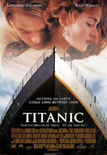
The poster for “Titanic” includes a close up embrace between the two famous actors within that film, relating to the romance issues of this film, yet their facial expressions convey a sense of sadness, relating to the tragedy within the plotline as well. The other prominent image of the poster is the ship, which of course is what the film is about and named after. As in our short film the train station is the place where Lucas experiences his visions, a train on the front of our poster would be relevant and is a possibility.
 |
| The Happening - Poster |
The poster for the film “The Happening”, is very clever and interesting, although it is a different genre to our film. This poster connotes the genre of horror/thriller and gives the impression that it’s going to be quite a fast paced action style film, with some element of tragedy implied. The protagonist’s name is featured on the poster as well as the tagline and the film name in quite a simple font style. Additionally, the choice of the cold blue/ dark tone reflects the genre of the film and mood of the plotline.
No comments:
Post a Comment